Aha! That makes sense. I think the transparent black version was better for this than the transparent white version, but I’d need to go back and look at it again. Would you classify either level 3 or 4 as “acceptable”, or are both of those significantly bad enough to make a nontrivial negative impact? (Of course ideally we can do better, but I want to gauge how bad it is as we balance this with the other issues we have)
I’ll play with it a bit on Monday (I’m done tonight for real this time lol). Might be coloring needing adjustment, might be sizing, etc.
I like the new colors and the next version and the next version. All the new color schemes are much easier for me to differentiate blue and green.
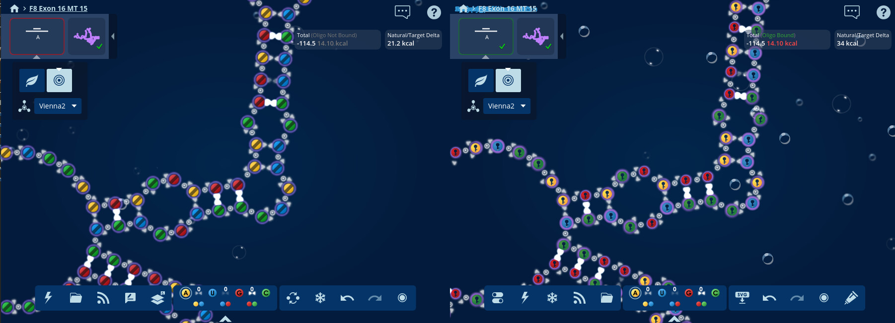
Separately, what do we want to do about locked bases. Do we want a new lock indication that is much less obvious than a key so that the base letter can be visible? We need to make sure the lock indication is intuitive to new players and I don’t think the current proposals are. When I’ve played other games, locked elements typically are grayed out or faded, similar to what we do with achievements on the achievements page, but that isn’t an option here. We need to maintain the same color.
Ok, I have a new option for y’all to test available on dev. It goes back to the “badge-style” locks, but with significantly simpler graphics and colors that are closer to the base color.
If this still has significant issues that can’t be resolved by tweaking the graphic (changing colors, thicknesses, positions, etc), the next thing I’ll propose is a dark stripe on the base when letters are disabled, and these badge locks when letters are enabled. When I played with the dark stripes, I thought they looked significantly better than the old lock graphics (and I don’t think has any of the problems raised with the other varieties we’ve tried). Absolute worst case I can add an option to use the old symbol when letters are off. My preference though is for the experience to be the most consistent for everyone - if we can have the exact same indications for everyone that’s best, if we have to use something similar but not quite the same with/without letters that’s next best, and I want to avoid having something significantly different or adding an option only a couple people would use if at all possible.
Try the new colors (which can be seen better) with the old lock symbol. You will still be able to see the color contrast and which ones are locked…
To clarify quickly, the problem with the old locks is that they can’t be used simultaneously with letters. While the color contrast is better now (including for colorblind users), in order to comply with accessibility standards, we can’t use just color to distinguish meaning. Brightness can be used, but it requires a 3:1 contrast ratio, which is impossible with 4 colors.
Colors are good. Can you try a black dot instead of the new lock symbol so I only have to focus on the color. The black should recede into the background and actually contrast nicely with the colors.
@JR1 Just having a dot is problematic since it’s not clear that means locked/disabled
I’ve been taking with Eli and he still has issue with these badges drawing attention outside the base since they create directionality.
JR, thoughts about the below? The idea would be that whenever letters are shown, the “badge” version (second) is shown, but in all other cases (letters disabled or zoomed further out), the “band” version is shown. I’ll be updating dev with this approach shortly (edit: available now).
I agree with Eli. The current one is only good if my face is 6 inches from the screen, any farther distance–blurry. How about a white dot with black slash?
Or any way you could point me to whatever choices are available so I don’t waist your time?
Re: blurry, There may be things I can do to improve the blurriness you’re seeing with the current version if I can get some additional clarification. Is this an issue with the version used when letters are showing, the version when letters are not showing, or both? Also, are you looking just at the screenshots, or have you actually loaded up a puzzle on Eternadev? If you’re only looking at the screenshot, it will look worse than it actually is due to differences in the screenshot being shrunk from its original size vs what happens when you actually zoom out (the lower screenshot in particular looks pretty lousy to me too, but way better in-game!).
When I tried white dot with black slash, it wasn’t super clear that it meant disabled and it draws a lot of attention due to the colors being very different from the background and bases (and honestly it generally doesn’t look very nice). I don’t have any other specific alternatives at hand - anything else we’ve come up with so far as been ruled out (some combination of not working at the same time letters are showing, not clearly meaning “locked”, or being too visually complex). (Don’t worry about wasting my time, I’m more concerned about wasting yours!)
I looked at EternaDev before replying. How about replacing the letter with a “L” or “X” when locked. Then add a new tutorial to explain how to lock a base.
Ok, good. Could you clarify whether you had an issue with bluriness just with the “badge” lock indicator used when letters are visible, or just the “stripe” when letters are not visible, or both?
How about replacing the letter with a “L” or “X” when locked.
We want to allow both the base letter and lock indicator to be shown at the same time, in case someone can’t rely on just using the color
Both. Blurry when small and distracting when large. I only use large to look at overlaps. How about making the locked NT a different shape?
Triangle, diamond?
Both. Blurry when small and distracting when large. I only use large to look at overlaps.
Starting with the second part of this first - are you aware that you can disable base letters to get the “band” lock graphic? Here’s a side-by-side with the old version - it should hopefully be less distracting than the old version since the graphic is significantly simpler (a simple line over the base instead of the key graphic).
Then looking at it zoomed out, I’m having a bit of difficulty understanding what your concern is compared to the older version - the lock graphics on the old version are also small and pixelated, but I guess for some reason the newer version reads as “fuzzy” to you which is more visually taxing?
Would it help if the locks were made darker at lower zoom levels, like the image on the right here? Maybe the increased contrast makes it easier to distinguish the line and feel less fuzzy? (make sure to click the image to expand it larger, though again it is still liable to look better in-game vs in the forum - hopefully this is good enough to compare if it’s better or not)
How about making the locked NT a different shape? Triangle, diamond?
We discussed that internally, but our concern is that it’s not intuitive - nothing about eg a diamond shape implies “you can’t change this”.
As always, thanks for your time working through this with me. We want to com up with something that will make Eterna more accessible for everyone, and it’s really important to get (and understand!) a wide variety of impressions to improve our design to accomplish that.
I’m also wondering if some of this is due to the additional antialiasing we have now. In order to make sure everything is positioned where it’s supposed to be (and make the animations smoother instead of jittery like they have been), we allow things to be located at partial pixel values. Below you can see a screenshot comparing what’s currently on dev (left) vs a version where I disabled this fractional positioning for locks (right). You can see the locks are slightly offset from where they should be (particularly noticeable when animating), but may look a little bit crisper. It’s quite subtle though (and again, sadly the screenshot loses some fidelity here).
All right, thanks for your flexibility. Please do reach out if after sitting with this for a while it proves to be a significant barrier - our goal here is to make Eterna useable by as many people as we can, if there’s things that make it unduly hard for anyone we want to make sure to address it!
@JR1 After releasing the latest version, Astromon also commented about them coming across as “blurry” and were able to narrow it down to an interaction between the darkness/opacity and the width. Could you take a look at the most recent iteration at https://eternadev.org/game/puzzle/10389928/? We’ve made the band slightly darker, a bit thinner, and added a circle (to help reinforce its disabled nature offsetting the thinner line). It seemed to resolve the issue for Astro, so I’m hoping it might help you too.
My only real concern with this is that it starts making the locks a bit distracting, and I’m waiting on Eli’s feedback there (since he raised that concern with previous attempts)
Hey all! I’ve had further discussions with Eli, who has raised concerns with visual discomfort, particularly motion sensitivity difficulties, with the most recent “striped” version of locks. We’re playing with a new simplified version of padlocks. @here If you could take a look at dev and let me know your thoughts, I’d appreciate it! I’ll probably target releasing it early next week unless I hear feedback otherwise.