@Omei: If you reduce the opacity, it should let more of the blue “through”, having the same effect I think.
@Omei
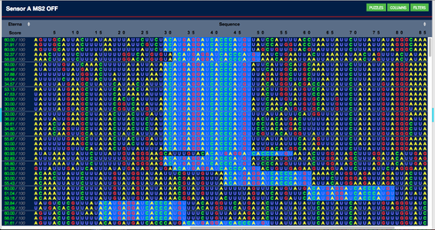
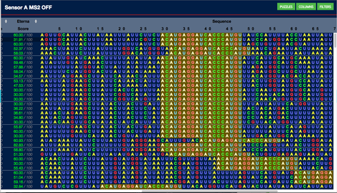
I made some examples using similar blues to the current background #023e91
The lighter blue blends in with the current colour scheme, But can be still scene by players.
Example using colour #011e46 (Top highlight) , (Mid) #0354c3 and (Lowest) #046af5 to highlight the background.
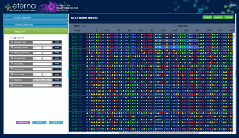
@LFP6: I’m afraid I’m not understanding what you are proposing. But here is the code that I am using to try things out.
$(“tbody tr .sequence”).each( function() {
var n = $(this).text().indexOf( “ACAUGAGGAUCACCCAUGU” );
$(this).find(“span”).each( function (index){
if (index >= n && index <= n+18) {
$(this).css( “background-color”, “#9999ff” );
}
})
})
You should be able to paste that into the debugger console window and it will change the background color of all the instances of the MS2 hairpin sequence. Tweak whatever css attributes you want and if you find something you like better, post it here.
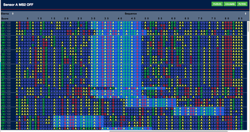
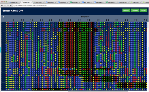
@Mat, looking at your screenshot, I liked the #046af5 best. But when the highlighting showed up in every line, like this
it seemed overwhelming.
This one, with #0354c3 seems better to me.
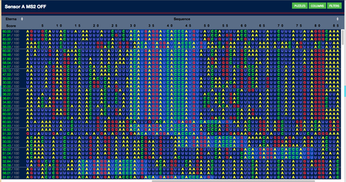
I agree that #023e91 shows up:
… but the border between what is highlighted and the rest of the sequence is hard to pick out. So of the three, I like the middle one best.
@Omei - Cool that was fast.
similar colour scheme
http://www.colorhexa.com/035edc
Monochromatic Color
http://prntscr.com/atm0di
@Mat, I really like what you have been up to. This looks very good to me.
@Omei, I agree with you that the middle blue shade #0354c3 is great. I really like it. Its my favorite so far.
#023e91 is nice too, but too weak. I would like to perhaps see one more test with one shade in the middle between them. Just to rule out that there is a compromise between them that would be better.
@LFP, thx for that blue shade idea
I decided to follow up on the idea of changing both background and letter colors. I think that will allow us to find something easier on the eyes. Here’s a possibility:
n… or maybe it is better to use font changes more than color changes. Here’s an example where the font changes take center stage, subtly reinforced by a black background.
It doesn’t jump out from the page as most of the others, which I suspect is good. But when expanded to a zoom level I would actually use in practice, the selected segments stand out well.
Hey Omei. I tried using that code, and I don’t see any background colors change. Anything in there I need to adjust before plugging it into the console window?
Oh, I got it, nvm.
@Omei. I like the Black background, But I found the green “C” font is a bit strong with the black background.
Could you try a slightly dark green font please ?
I think the current C nucleotide font colour is #3f3 which is equal to #33ff33

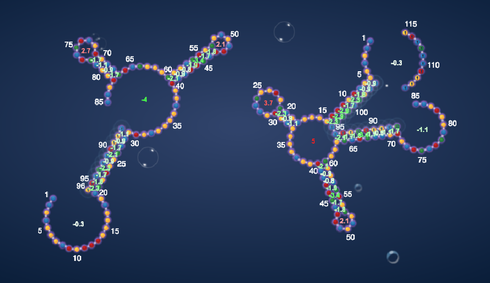
@all: I’ve been thinking about the possible advantages of basing something like this off a graphical, rather than textual, representation. Consider the circle diagram in this image.

Here, the bases are arranged in order around the perimeter of a circle, and arcs are drawn between bases that are paired. I’ve seen this representation before, but never saw any advantage over the 2D structure graphs we’re accustomed to for viewing a single folding.
But I’m thinking this representation may be useful for visualizing switches, where we want to compare the foldings among multiple states. In the simplest case, we could simply draw the pairings for all states in one circle, using a different color for each state. Overlaying four states at once might be too cluttered, but last night I ran across a visualization technique that uses an additional hierarchical relationship (which an RNA foldings has) to bundle lines, like this.
Any thoughts?
With this circular diagram, having the ability to step from blank to state 1, 1+ 2,1+ 2+ 3,1+2 + 3 + 4 ? I think I like it ![]() Then, add the ability to step through several player designs viewing the same state in each? I’d like it evermore :)
Then, add the ability to step through several player designs viewing the same state in each? I’d like it evermore :)
Those would certainly be possible. At this point, I was mostly thinking about whether this is a visualization that would facilitate comparison of structures.
As an example, looking at the visualization below, how long does it take you “line up” the two foldings in order to understand what is moving, and how? Depending on whether or not I got lucky in starting with the right feature, it would probably take me somewhere between one and 5 seconds. But with the circle diagram, the alignment between the two would be immediately obvious, because all the bases are in the identical positions in both states.
Agreed with whbob
Being ability to step through several player designs to get over view and comparison on what maybe happening, is also needed.
Do you think seeing them sequentially is more valuable than seeing them simultaneously? (The latter being the approach I have been taking with the right panel reflecting whatever designs the player selects.)
Doing able to view the Main list and 2D Structure or Switch graph simultaneously is more valuable for a number of reasons. One being a very big time saving and you don’t have to go and out of multi windows saving a lot of clicking.
http://prntscr.com/axcfgz
Well it would be if the 2d structure was displayed.
http://prntscr.com/axcgog
Talking of simultaneously vs sequentially here is a very quick rough one.
Could we have the option of being able the view the lab descriptions in the center section of the screen, when selecting labs from the Puzzle selection list ?
For the example I used the Home button where the 2D Structure would be displayed to navigate back to the Previous Lab Projects.
http://prntscr.com/axchzo
In addition to the current display.
http://prntscr.com/axciyw
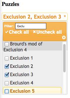
@mat: Re the Puzzle and column selection, let me start by saying that I consider the current implementation to be only a stopgap measure. In particular, the puzzle selection will quickly become untenable as more lab data is added.
For the initial release, I had hoped to implement puzzle selection with one (or perhaps more) selection boxes like this:
I put this on hold because I couldn’t get the library code for this control to play well with the code for the layout manager. But I don’t think it is an insurmountable problem, and that remains a possible path forward.
But this alone still would not be the ultimate solution for the bigger question of “How do I quickly find the data I am interested in”? I interpret your request as another approach to that issue. (Am I right?)
I do have some concern about having the open source (HTML5) browser code relying on the legacy (closed source, PHP+CoffeeScript+Flash) code any more than necessary. Certainly, while we have both, smooth integration is an asset. But I think there is a general consensus among the dev team that on the whole, the legacy code represents the past, not the future, of Eterna.
But as an example of a concept, I’m interested in your example. Can you elaborate on how you would use the lab pages, and perhaps distill that down to something that could be implemented within the browser?
@mat: Re the 2D structure that didn’t completely load, I have had that happen to me once or twice also, but I haven’t figured out what triggers it. In my experience, it has just been a one-time occurrence, and isn’t repeatable if you select a different puzzle and then come back to the original. Is that what you saw? If you observe any pattern in when it happens, please let me know so I can track it down.
