The color of chat names as well as the entry line for text is sometimes very hard to read due to low contrasting colors. Can the chat colors please be either modifyable or simply white text on dark background (like in foldit) ?
Thanks for your feedback. At present, we are experimenting with different combinations of colors for chat names. Your thoughts are valuable for us. I’ve included your suggestion as#151in the bug tracker.
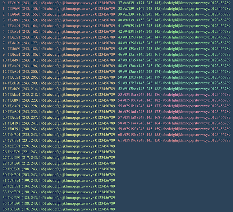
Actually, it’s bug #152.
Actually, I like the colors, especially fuscia and bright aqua. Much easier to follow chats than before. Maybe the green-gray is a bit dull.
We have a developer working on this, and it should be done soon. We’ll let you know when it is.
If these are the ‘new’ colors (grayish green; greenish gray; grayish blue; beige) please bring back the old ones. They were easy to see and made chat easier to follow.!
We are working on an intermediate set of colors which are hopefully going to be easy to distinguish between players and also easy to distinguish from the background. What do you think?
The new colors are better, but the yellows are quite close to the text color - pink and green and even peach and yellow-green are ok.
I cant even look at those colour combinations let alone read it for any length of time and I am wearing glasses.
I guess the colours are okay if you are 18 and have perfect vision.
The easiest for anyone and everyone to read, would be black on white background with the nicknames in a couple of primary colours…Like good old standard IRC.
Kristein: The reason why we have so many colors is twofold: (1) to decrease the likelihood that two players typing subsequently in chat have the same color name, and (2) to provide contrast with the blue background. Are you having trouble reading all the chat text or just the player names? If both, our choice of font may also be an issue. We’re planning on changing the font to Helvetica, as described in feature request 165 in the bug tracker. Please let us know if legibility is still an issue and we can look into color changes as well. Thank you for your feedback!
Adrien, I think it would be good if the user can change between color styles, that will make everyone happy. I too prefer white text on the current background. Names in bold and a careful reader should be able to keep track of the conversation. Maybe a little larger window.
Have you guys seen the beautiful new chat window? Does this answer most of your problems, or do we need to try harder.
Thanks for helping make EteRNA excellent!
The font change has made it soooo much better and the brighter colours for names is excellent also *thumbs up*
This bug (#165) is now marked as closed. Thank you for your help, and please send more feedback as we prepare for EteRNA’s big launch on January 11th.