I feel that for a community self-selected for interest in the sciences there is a distinct paucity of graphs. Graphs are used for a reason; they make data much easier to understand!*
Since nothing gets people more eager to jump on a topic than the opportunity to correct people, observe an overview graph of the data from the synthesized designs of One Bulge Cross from someone who is not very good with spreadsheets.
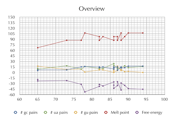
It can be noted that this is nearly useless. The best designs stay within a pretty narrow range for those easily-input-into-spreadsheets categories, which was already obvious. But wait, there seems to be a positive correlation between score and melting point!

Not really; it looks like it’s just that one 65 being an outlier. Well, maybe a bit? I don’t know! I’m not even sure what r squared is, and I’m in a college halfway across the state (the long way) where I don’t know anybody yet to ask and I’m not leaving my room because it’s like 40 degrees out there so I’m hanging out on the interwebs like some antisocial person. Yay! (no.)
Anyway, the next closest thing to a trend was seen in GU pairs.

This looks closer to an actual legitimate correlation. Comments?
What would be welcome would be some sort of chart about, say, what sort of sequence is most likely to go out of whack or something. Anyone?
* “Do not attempt to emphasize simple statements by using a mark of exclamation.” -Strunk and White