I would be interested in the spreadsheet type summary contribution of what players can conclude from say, the top 12 designs. A sort of what characteristics do they think contributed to this design succeeding. Then players can interpret the results back into their individual designs or their bots. If you want to get snotty - create lab periods - No contribution, no lab/puzzle points for that period unless contribution to spreadsheet, but I think that would be too harsh, probably should just go for an analysis badge.
The data and presentation is still preliminary, but I want to let players know that the first rapid feedback, bead-based experiments were a success!
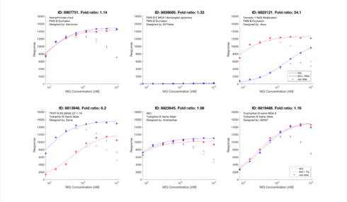
Of the six design, one for each puzzle was verified to have a significant fold change.
What we have learned so far from this process falls in several of the four sub-replies I originally broke this forum topic into. I’m going to add additional comments in the most relevant reply threads.
In terms of analysis of the initial rapid feedback experiment (see below), the first thing I want to show is the use of a new visualization that @jandersonlee and I first demonstrated at Eternacon.
So you don’t have to flip back and forth between the results and the visualization, here are the results just for the FMN B Exclusion puzzle.
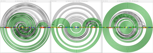
And here are corresponding arc graphs showing both the MFE and the ensemble base pairing frequencies for the corresponding designs.
(I realize that not everyone reading this will have seen our Eternacon presentation yet. If you haven’t, the following may not make much sense until you have.)
These three charts say a lot about their corresponding designs – much more so than the MFE foldings we all see in the game. The green lines are an alternative representation of the MFE folding displayed in the game. The gray lines correspond to the information that the dot plot gives for single-state puzzles. (But which hasn’t been updated to accurately reflect switches.) It acknowledges the fact that RNA molecules are actually constantly “dancing” between a large number of different foldings (know as the ensemble), and represents the folding engine’s calculation of the frequency with which any two bases are paired.
Even if that doesn’t make a lot of sense to you yet, try to bear with me as I comment on each chart.
The first chart, for Astomon-new mod, shows that a lot of the time, bases are predicted to be pairing up in ways that rule are inconsistent with the MFE folding. In the old days single-state lab designs, this was known as a “dirty dot plot”, and suggested the design would not be likely to score well. This is true for both On and Off states, and so an initial reading of this graph would suggest this would not make a great switch.
The second chart, for FMN B E MGA (by Eli), is very different. First of all, it is “cleaner”. But even more significant is that while all the alternate pairings in state 1 (ON) are in conflict with the MFE folding, all the alternate pairings in state 2 (OFF) reinforce the MFE pairings. This suggests the switch will stay off much more than what the MFE folding in the game suggests, and the data shows this is exactly what happened in the lab.
The third shart, for Comedy 1 (by Jieux) is somewhere in the middle ground of the first two. Overall, the ensemble is “cleaner” than the first, but less than the second. On the other hand, the non-MFE base pairings are a mixed bag – in each state some conflict with the MFE pairings and some reinforce them. This seems like the most promising of the three designs, but probably not as good as we could expect to be thermodynamically optimal. And indeed, that is very consistent with what was measured in the lab.
In the past, we have often bemoaned the inadequacies of the available energy models. (By the way, I used Vienna2 for the above.) What this new visualization tells me is that the models may actually be significantly more accurate than we’ve been giving them credit for – we just haven’t been asking them the right question when it comes to predicting lab results.
This is super interesting!
These fold change graphs seems have predictive power, just as the Wuami graphs we got for labs with inputs earlier.
Could we have a similar solution to what we got then?
- A server that can give us immediate feedback on a design while we are designing?
- Or a fusion table over the already computed active lab designs?
I find it interesting in the above image that there seem to be a trend for that the raw data give a downward moving trend at the end (right) where as the real life data tends to give a more raising curve or a slower dip at the end.
Entangled aptamers
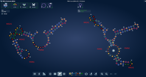
My design with with entangled aptamers that I am curious about, didn’t work as intended. However I wish to highlight that Zama’s design which did show fold change, indeed has entangled aptamers.
I will attempt to move the two entangled aptamers both closer but also further appart. I expect this will affect the fold change either for better or worse. I would really love to be able to run the comming Zama mods through a fold change estimate server. ![]()
Astromon had a question on the new fold change graphs
Astromon: on another note what did you see in those graphs?
eli: graphs - like the fold change ones?
Astromon: ya
eli: I see the future… ![]()
Astromon: was wondering about the raw data part
haha
eli: I suspect that the raw data part are like simulation. Calculated in energy model before the designs are run in lab.
Astromon: wow ok!
eli: So they are like prediction points. What is so promising is that the prediction points are so close to the actual data.
Astromon: indeed
have seperation
eli: Which is why the faster we get a server/tool/script that can make these graphs, the better designs we can make
Astromon: yay!!!
they working in Vienna2 predictions
eli: So these new graphs are akin to the Wuami charts we got for the TB labs. They have predictive power.
Astromon: sweet
eli: They can give us a sense for if we have our design switch in the right direction and give us fast feedback on if what we are playing with have a shot at working.
Perhaps I’m just misinterpreting the origin of those graphs that Omei posted in this forum post, but I believe they are the graphs with the experimental data that Michael in the Das Lab generated from the new experimental procedure. They are functionally equivalent to the graphs that Johan produced through the custom Illumina sequencer/microscope, just without the fancy stuff.
One possible origin for the “raw data points” and the decrease in response as a function of concentration could be that they are raw data before a statistical correction. Response may decrease as a function of time, whether it’s due to degradation of the RNA, or possibly some kind of change in binding affinity as malachite green increases in concentration.
I’ll try to provide more specific details as I learn them, but basically, I think Brourd’s description is accurate.
Sigh. I wish I had been right.
And Zama would like to see them too. ![]()
Is there a better way of picking designs to test then voting? It would be nice if each player could choose their favorite design for testing. If you can’t test that many then allow the players with the most designs pick until which time you can do one for each. Or some variation of the above…
Since you seem to be focusing your analysis on Vienna 2, should we be most concerned about our designs working in Vienna 2?
In past labs, I like to go to the classic data browser, select a design ID and use the U and D keys to step through the 2D images. Sometimes players place their unique label for their design in an area of title or comments that gets cut off in the list view. When that happens, there is no way to tell what the designID is for that image. Is there a way to have the designID come up in the 2D image of a design?
In past labs, I like to go to the classic data browser, select a design ID and use the U and D keys to step through the 2D images. Sometimes players place their unique label for their design in an area of title or comments that gets cut off in the list view. When that happens, there is no way to tell what the designID is for that image. Is there a way to have the designID come up in the 2D image of a design?
@Zama It’s my feeling that Vienna2 has been making the best predictions, but it is not a hypothesis I have tried to rigorously test. That would be a great project for someone to take on. It wouldn’t have to be a huge undertaking. Maybe just start with a list of the designs from a recent puzzle, along with their scores, and then go through and check off whether each folding engine predicts it will switch or not. I could help with producing the starting spreadsheet of designs and then with the summarization.
The main reason for focusing on Vienna2, though, is that it is the version I am most familiar with using in a batch processing mode.
@whbob That’s a very good suggestion. At the moment, we’re focusing on getting rid of flash while not changing the game functionality, so that we have a clear comparison between the two. But I’ll see if this is something small enough that we can slip it in somehow. Ah! With a booster. ![]()
Hi Zama! Just in case it wasn’t clear, all the designs will be tested at the end of the round, as before. It’s just this fast-track process for (limited) rapid feedback that we’re working an adding as a new component to the process.
Player voting has a lot of advantages, first and foremost the involvement of players. What I think we need, and am working on providing, is more immediate evaluation of designs, using multiple criteria, so that players can focus their human evaluation on the relatively few designs that fall in their category of interest. We’re a long way from providing that now, but I really think it will spur progress.
This is not to say that we are absolutely stuck on using player voting as the final decision process, so keep up the discussion.
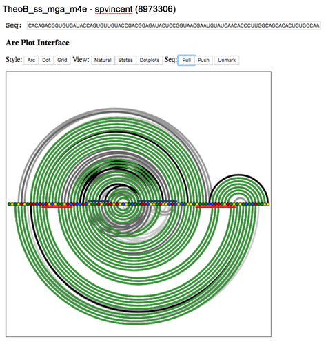
I am creating a Google doc with arc graphs for as many voted-for designs in the two current fast-track puzzles as I have time to do. Currently, it has the five designs that were at the top of the Theophylline B Same State (MGA) designs, sorted by vote. Here’s an example
I’ll switch to Tetracycline B Same State (MGA), do five there, and then see where my day stands.
No problem, Omei, as always, you were clear. But for me, these are the first test results I’ve ever seen since starting to play Eterna. I have long forgotten what I might have been trying to accomplish in those previous labs. I thought it would be nice for everyone to get a chance to glimpse the efficacy of their master plan- before they forget what it was ![]()
I didn’t realize Zamas fmn puzzle was rapid tested I thought it was the trytophan? did
this fmn get tested also?


