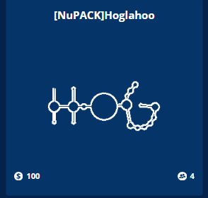
The puzzle card could use some work. The model used should be reorganized so that it’s no longer in the name. The number of puzzle states should be on the card. Any special properties that need to be known from a glance should be here.
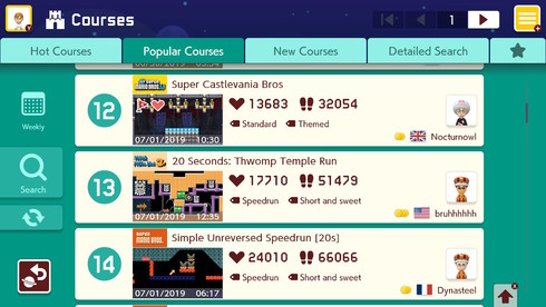
To use Mario Maker as an example
You can see that for each course that is listed, there are a couple of important details shown
The current method of showing puzzles is too vague, and tbh it’s kind of useless. We don’t really need that large of a puzzle structure preview on the card. The information shown in the mario maker preview is the kind of information a player will look for when determining if they want to play a puzzle. Some of that information includes:
- What is the energy model?
- Who is the author?
- How many times has this puzzle been opened?
- NOTE: THEY DON’T SHOW THE NUMBER OF CLEARS OR CLEAR RATE HERE. That alters player expectations and makes them less likely to play a puzzle.
- What kind of puzzle is it? (switch, single state, oligo, is there a molecule energy bonus)
- When was the puzzle published?
These are all notes to be taken on making the puzzle card, because why have a full image preview of the puzzle when the clicking on it redirects you to another full image of the puzzle? Make it smaller and more economical.
Also, do the puzzle cards need to be the same as they have always been?


