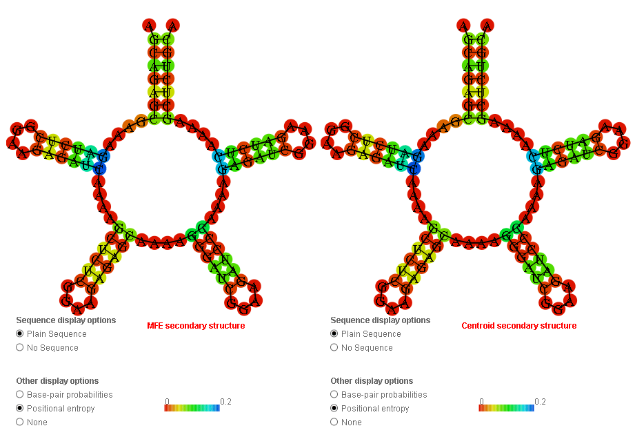
I’ve encountered something that made me go ‘hmmm’. I ran Deep Thought’s Supernova (round 4 submission) through RNAfold and the barrier web server to see what happens. Barrier server only takes 100 nucleotides as a limit - and without thinking, I used that same sequence in RNAfold.
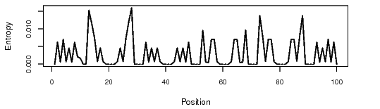
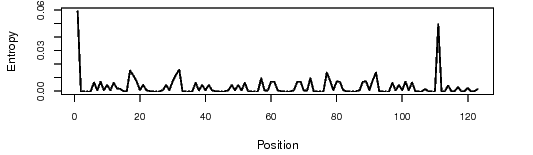
The bit that I found interesting - according to what I’ve seen so far (and I could be waaaaayyy off-base) loops are a destabilising factor in RNA folding. Yet, when comparing the positional entropy for the full 123 nucleotide sequence in RNAfold with the 100 nucleotide sequence, 123 looks better.
So if the top loop is a destabilising factor, why does the positional entropy favour having it there in the first place?
I think what you’re seeing is the skewing of the scale of the positional entropy graphic by the relatively high entropy of the potential base-pairing of nucleotides 1&111 in the complete sequence.
RNAfold seems to color the most questionable nucleotides blue and then set everything else from there, so if there’s one pair that’s a lot more questionable than everything else you end up with a positional entropy graphic that looks all red (except for that one pair) whereas if there’s relatively even but very small positional entropy throughout the design you get a more colorful graphic. The “scale” number is not very helpful in this graphic either, because I’ve never seen it tell me that blue corresponds to anything below 0.2.
The small positional entropy plot at the bottom of the RNAfold output is a little more reliable, since it actually does adjust the scale to below 0.2. If you compare the two graphs below (for the 100-base truncated “Supernova” and the complete “Supernova” you can see that the graphs are the same just on a different scale and with the second one including the range-skewing pair at 1&111. The second may look “flatter” through most of the graph, but if you actually compare the heights of peaks with reference to the scale on the side you will see that they are the same:
This is why I don’t think having an “all-red” positional entropy graphic is a reliable indicator of anything, and certainly not useful in comparing two different designs.
That’s exactly right adlai, the “top loop” is not really a loop because it has two ends and is not closed, the circular shape is just how the program shows unstructured, single-stranded regions.
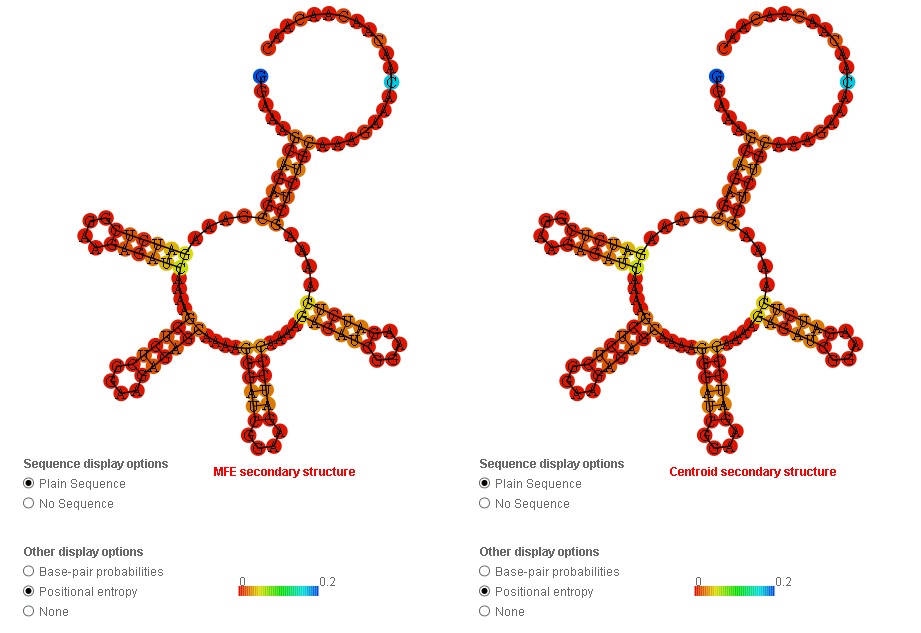
Unfortunately, all of the lab designs are required to have this section at the end which cannot be modified because it’s used as a binding site for the enzymes that probe the structure.
As far as I know such a structure, in the model, has 0 energy.